What are Pantone colors? Achieving consistent colors is often a vital part of creating visual works. The Pantone Color Matching System is an industry-standard means of addressing that challenge.


In this article, we’ll discuss Pantone’s means of ensuring that colors are reproduced accurately—and we’ll talk about whether you need it for your current project and how you can use it. We’ll also take a look at the Pantone Color of the Year, a fun annual color selection to celebrate.
What Is Pantone?
Pantone is an American company that is largely known for the Pantone Color Matching System (or PMS). It originated in the 1960s, founded by Lawrence Herbert, who was involved with a printing company. Pantone came from the need for standardized color matching—and that’s exactly what it’s about, even today.
Let’s take a moment to discuss what a standardized color matching system means. Pantone Color Matching allows you to reproduce and match colors with precision, even across different printers and situations. So let’s say your branding uses the color orange. Well, “orange” could be many different shades of orange. You could have a light orange, a dark orange, a more saturated orange, or an orange that leans more into yellow. Think about how much variety you could have, simply with the color “orange”.

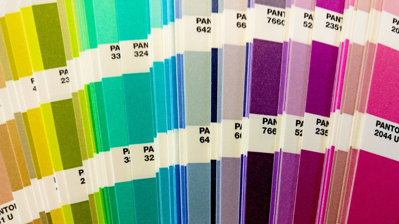
On the other hand, when you choose a specific orange using the Pantone Color Matching System, you know what orange you’re getting—the exact shade, hue, everything—and it’s not going to vary. You’re going to get an exact color match. That’s why this is a graphic design essential. It gives designers a set of standardized colors to use as a guide, and each color is identified with a unique Pantone number. The system helps ensure consistency across the production of your printed projects.
How the Pantone Color Matching System Works
The Pantone Color Matching System has a couple of components you should know. First, the colors all have a unique identification number. And second, the colors come in both solid and process colors.
Solid Colors are going to give you the highest degree of color precision and accuracy. This would be a great choice when you absolutely want the exact color, e.g. for branding.
Process colors are best reserved for situations where color accuracy isn’t as strict, and they are typically composed of a limited number of inks (for example, CMYK would be 4-process colors).
You may also see either “C” or “U” by a Pantone Color. For example, let’s check out Pantone 6126 C, a lovely shade similar to cerulean blue.

That “C” stands for Coated, and the “U” stands for “Uncoated”. In printing, coated paper has a finish that affects the quality of your print. Think about something like a magazine—it has a glossy, finished feel. Uncoated paper, on the other hand, has a different finish and tends to yield a less sharp print.
So, when you tell a printer you want to use Pantone 6126, that color is created using set inks to create that exact color—those proportions are precise and achieve the desired shade. Because these inks are standardized, it’s going to ensure consistency in color reproduction across all kinds of different printing processes and materials.
How Many Pantone Colors Are There Exactly?
Now, if you’re thinking about color, you might be wondering: how in the world can you give a number to how many colors there are? How many Pantone Colors are there?

There are currently 2,390 Pantone Colors as of 2023—however, that will likely change in 2024, as 224 new PMS colors were released in 2023. The human eye can see millions of colors, though, so clearly this isn’t every possible color out there. We continue to see Pantone Colors expand and include more colors. It’s difficult to say that over 2,000 colors isn’t a hefty amount!
How Do You Use a Pantone Color Guide?
So you’ve decided you want to try using Pantone Color Matching in your work. Where do you start?
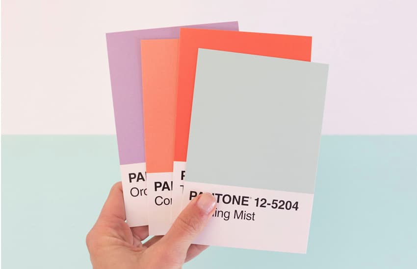
When it comes to the Pantone Color Matching System for printed projects, you’ll need one of their guides. You can buy color guides directly from Pantone, so you can page through them and choose the exact color you want.

In addition, you can sign up for Pantone Connect, their digital offering, which can show you additional information, like Hex to Pantone and CMYK to Pantone matching. It’s very convenient, but keep in mind that none of these resources are free.
What Are Pantone Colors For? How Important Is Color Matching?
So what are Pantone Colors for? What kinds of projects use them, and why? Does it really matter if your colors aren’t an exact match? The answers very much depend on the nature of your project and what you’re trying to achieve.

Graphic Designers
Precise color selection is often an essential part of graphic design, especially with content like logo design and branding. Think, for example, about a logo where the key colors aren’t accurate—yikes! With clearly defined color matching, you’ll know your brand’s colors are exactly as intended, every time. Designers can use Pantone colors to ensure that consistency is accurately captured in their printed projects.
Printers and the Printing Industry
Likewise, this is essential for printers too. The printing industry can rely on Pantone colors to achieve consistent, high-quality results—and you can rely on those specific Pantone numbers to correctly mix just the right color, with no room for error. You want the final printed project to match what the designer had in mind, and this system of color matching gives both parties just that.
Tip: read the ultimate guide to the different printing methods to learn more about this industry.
Fashion Design
There are Pantone Color Guides for apparel and fabrics too! Think about it—you want your fashion design project to be just the right color. Remember, if you’re looking for “orange”, that can mean a lot of different shades and hues of orange. You wouldn’t want to make a major decision about manufacturing a clothing piece based on a color as displayed on a computer screen.
Even More Industries
Other industries benefit from color matching too, like interior design, paints, packaging, and more. If you’re curious about the additional applications of Pantone’s color matching systems, make sure to check out their guidelines. There’s plenty more to see.

But Do You Always Need Precise Color Matching?
The short answer is: No, you don’t always need precise color matching. For example, let’s say you’re printing up some event posters. It’s a short-run job, and while consistency is important, you’re not that concerned about 100% color accuracy. Where does that leave you?
- You’ll still have design proofing on your side. A design proof is a test version of your final project, like a checkpoint before printing the entire job. When it comes to print, you’ll likely want a hard-copy proof, and this is your chance to check things like the colors. If something’s really off, you can make adjustments before things go to print.
- Some projects just don’t need that kind of precision. For example, perhaps a slight variety in value doesn’t have a big impact on your final product. In digital printing, for example, you may see less color accuracy, but it’s not always the most essential part of a project (e.g. you may be weighing options like price, turnaround time, and the extent of your print run).
Still, it’s valuable to know about the Pantone Matching System—what it’s for and how you can use it. With this knowledge, you’ll know when it’s the best choice for your projects and when it’s not necessarily your first choice.

Having a Pantone Color Guide in your design toolkit can also be a great asset. Coming up with the right color schemes and getting a feel for different colors, especially in a print environment, can make it a valuable asset. Most of us have experienced this: you design something on a computer, and then you print it and… the colors are not quite the same. Monitors and paper are two very different mediums. So having that hard-copy color reference can make a big difference. Remember, Pantone doesn’t exclusively refer to spot colors—they include process colors too.
What Is the Pantone Color of the Year?
Every year, Pantone announces the Pantone Color of the Year. It’s more than just a special color for the year to come. Pantone makes the selection based on current trends that influence design—as well as capturing the general mood of the time. It’s an announcement that folks across creative industries look forward to every year.
But the Pantone Color of the Year is more than just a color announcement. We also get info about the color, potential applications, and inspiration—what makes this color a reflection of where we are and the year to come. There is often social and cultural context behind the selection, and creatives often take inspiration from this selection too. For example, there was a special Motorola phone in the Pantone Color of the Year for 2023—and there were sneakers, fabric prints, and more to celebrate too!
When is the next Pantone Color of the Year announced? Announcements tend to be at the beginning of December of each year—so stay on the lookout, each year, for what the New Year’s color will be!
Pantone Color of the Year 2025
In 2025, the Pantone Color of the Year is the timeless Mocha Mousse. It’s a grounding, neutral, and highly versatile color. According to Pantone, it captures a global mood of connection, comfort, and harmony. A nurturing choice that every brand and designer can make the most of!

Pantone Color of the Year 2024
The Pantone Color of the Year for 2024 has been announced as Peach Fuzz 13-1023. This soft and velvety peach tone is said to envelop us with a spirit of warmth that enhances the well-being of mind, body, and soul. Pantone is hoping this color brings you comfort and contentment this year.

This is Pantone’s 25th year celebrating color of the year and have previously featured three other orange colors (2004’s Tigerlily, 2012’s Tangerine Tango and 2019’s Living Coral).
Pantone Color of the Year 2023
The Pantone Color of the Year for 2023 was Viva Magenta 18-1750. It’s a beautiful, warm color with strong red tones. Pantone notes that it was chosen as a “new signal of strength”—a brave and fearless color choice.

There’s definitely something very vibrant and lively about this color, isn’t there? It’s a saturated color that would certainly stand out. Pantone also described this color selection as “audacious, full of wit, and inclusive of all”.
Interestingly, you can also explore the “Magentaverse”—which is a collection of colors that complement Viva Magenta.

Pantone Color of the Year 2022
The Pantone Color of the Year for 2022 was Very Peri 17-3938, a periwinkle color. Pantone described this selection as a curious one in the midst of times of transition. The 2020s have been a challenging decade, and as we entered 2022, it was very much a time of returning to normal while also remaining changed forever. This color has the qualities of both blue and red, embodying the duality of the world we’re living in—one of hope and possibility, while also one of unprecedented change.


